The Internet Is A Magazine
Thinking of digital platforms as a magazine’s latest issue helps us approach content differently and reminds us to keep things fresh.
Good editorial is skimmable and visually striking — the same goes for content on your digital platform. Users should be able to engage with your platform, scan with ease, and take away what they need.
Just as we mentioned in our post:
Creating content should focus on your users’ needs. Deciding what content to include is about finding the middle ground between what your organization wants to say and what your users want to know. It starts with ruthless editing (and it helps to have an awesome Content Director ghostwrite half the stuff you take credit for).
Find the middle ground: what you want to say vs. what your users want to know.
As a general rule, we recommend taking your first draft and cutting it in half. This will force you to remove unnecessary words, sentences, and paragraphs. Trust us, it’ll sound better and more importantly, increase the chances of it being read. Seriously, you should see the look of joy on our Content Director, Ryan McGrew’s face when he makes a word count go down!
Once your content is focused and at an appropriate length, consider the importance of structure. In their article about storytelling as a business tool, Harvard Business Review notes that content structure is a better predictor of success than the actual content.
Content structure is a better predictor of success than the actual content.
There are plenty of ways to structure long-form content that make it more digestible. Block quotes, headlines, and captions all help to provide variation — and variation keeps users interested.
Of course, we can’t forget about images — they can make or literally break your platform. Choosing the right images that represent your brand is one thing. Making sure they’re optimized and the right dimension for your platform is another. Pixelated or poorly cropped imagery hurts your brand’s reputation. No one has time to wait for massive images to load, performance is key.
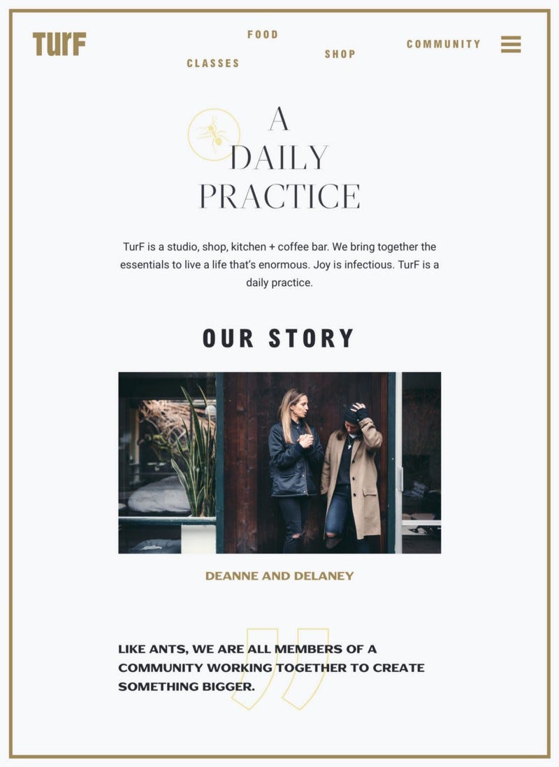
TurF is a great example of how content structure can bring an About page to life. While most About pages are typically made up of static images and large blocks of text, the page we collaborated on with TurF uses subtle animations, block quotes, and bite-size copy to tell their story.
You don’t have to reinvent the wheel on every page. For pages with similar content, we create customizable templates. That way we’re creating something that’s efficient and offers maximum flexibility — two birds. We took this approach on our own digital platform. You can see how the case studies for Farmboy Fine Arts and Whistler Brewing look quite different but have similar conventions.
Thinking of digital platforms as a magazine’s latest issue helps us approach content differently and reminds us to keep things fresh. With all this in mind, take a look at the images on your platform — are they awesome? How about your text — would you want to read it? If not, go ahead and make some changes!
Now that we have the terminology, UX and content covered — how do we measure what’s working? We’ll get into that next.
If It Can’t Be Measured, It Doesn’t Exist
Your new digital platform just went live, that was a big job but now what? How do you know what’s working and what’s not? Where are your users coming from and what are they doing? Getting your platform up and running is exciting, but it’s just the beginning. Monitoring your platform and improving what resonates with your users makes it great.


